The following case study is based on a real-life project, but the names of the individuals and organizations involved have been changed to protect their confidentiality as per our non-disclosure agreement.
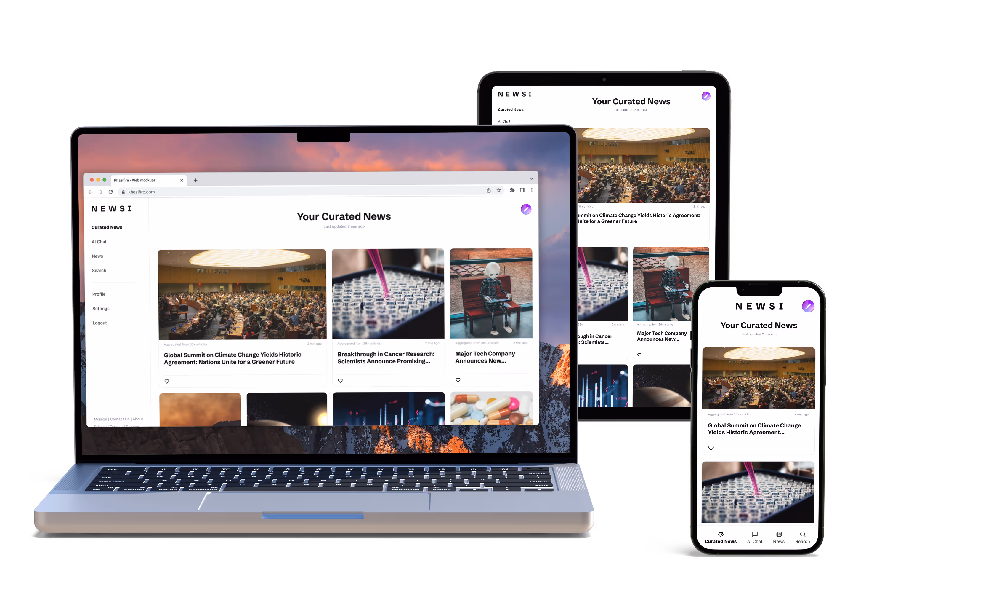
I began by exploring potential locations for the new feature on the existing page. After developing several options and evaluating them based on past user behavior patterns, I concluded that the top right-hand corner of the screen was the optimal placement. Users typically scan a page in an "F" pattern, making the top left of the screen the most important, with the top line being the second most important. By placing the new feature in an unused section of the top "F" line, it becomes immediately visible to new users.

To facilitate user editing of personal algorithms, I designed a button featuring a pencil icon at its center. The pencil icon is easily identifiable as an editing tool due to its prevalent use in many other programs. I incorporated a gradient of the brand colors as the button's background and used negative space to define the pencil icon. This design was finalized because it stood out effectively against the page's white background.

The client requested an interactive element for the icon, so I created a Lottie animation with the gradient background spinning. As users naturally focus on moving elements on a page, this animation activates whenever the user hovers over the icon.
The user flow was fairly simple:
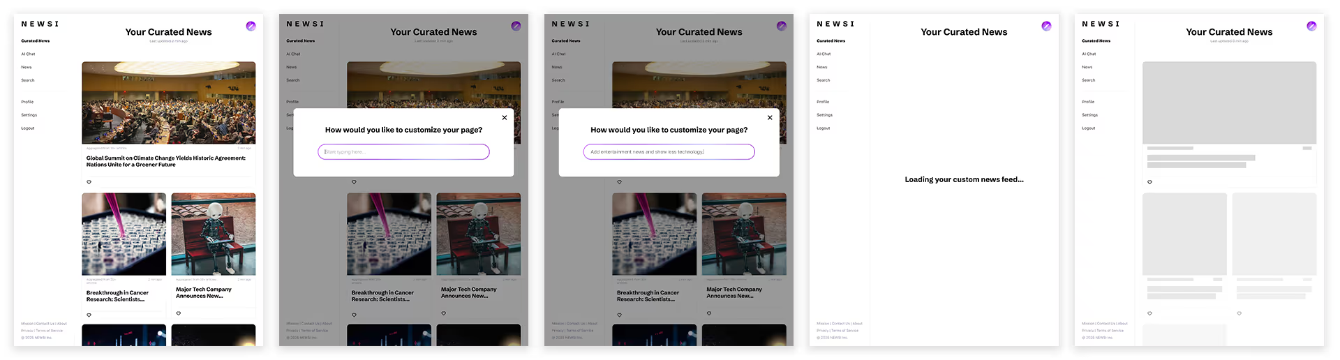
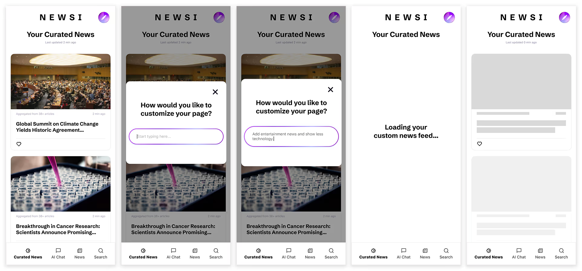
User selects the AI editor feature --> Feature opens a plain language chat --> User enters desired changes to the news curation --> AI chat accepts changes and reloads the page with newly curated content.
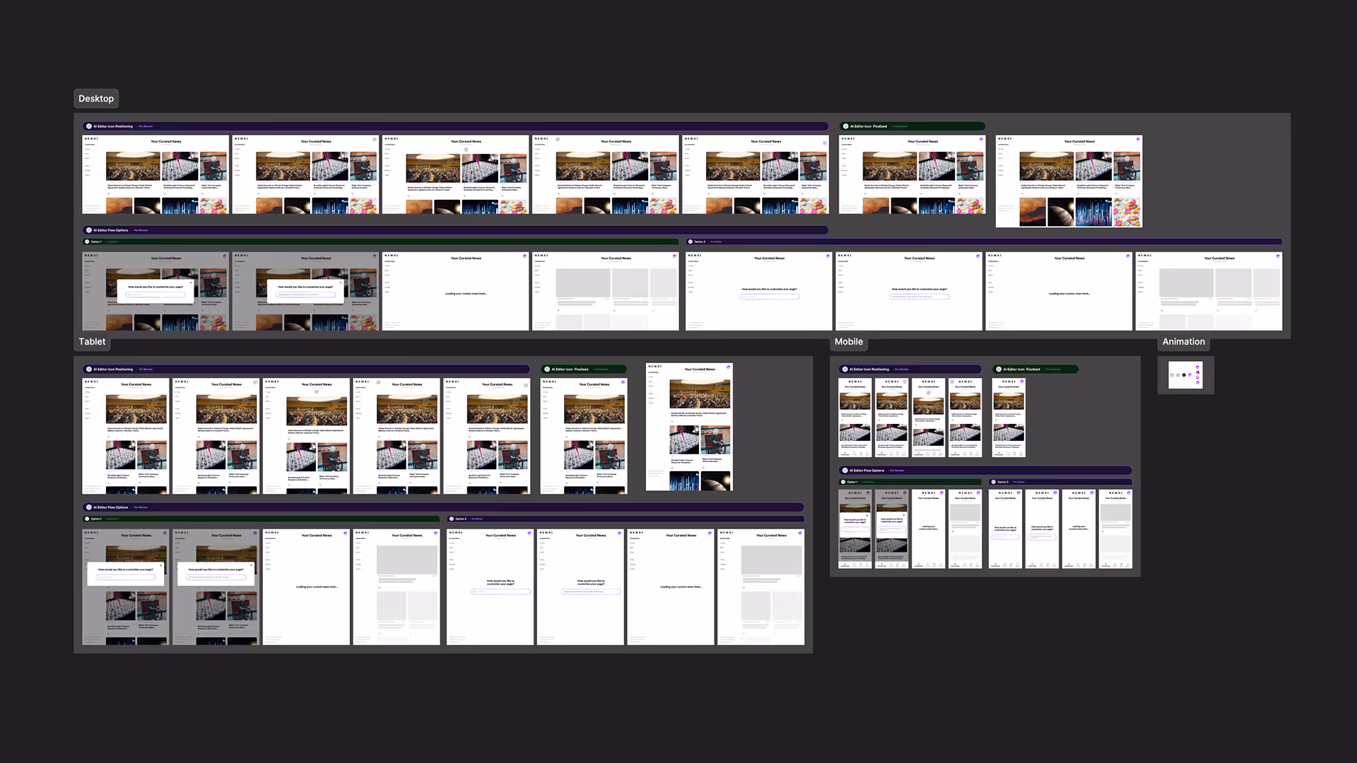
I designed two intuitive options for this flow, as shown below.
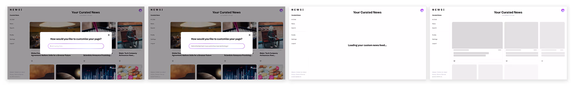
Considering how the page would appear on tablets and mobile devices, and whether a user might want to cancel the action, I concluded that the first option was the most suitable. It allows users to opt out of editing their curated algorithm more intuitively, whereas the second option caused confusion and made users feel as though they were leaving the news page entirely.
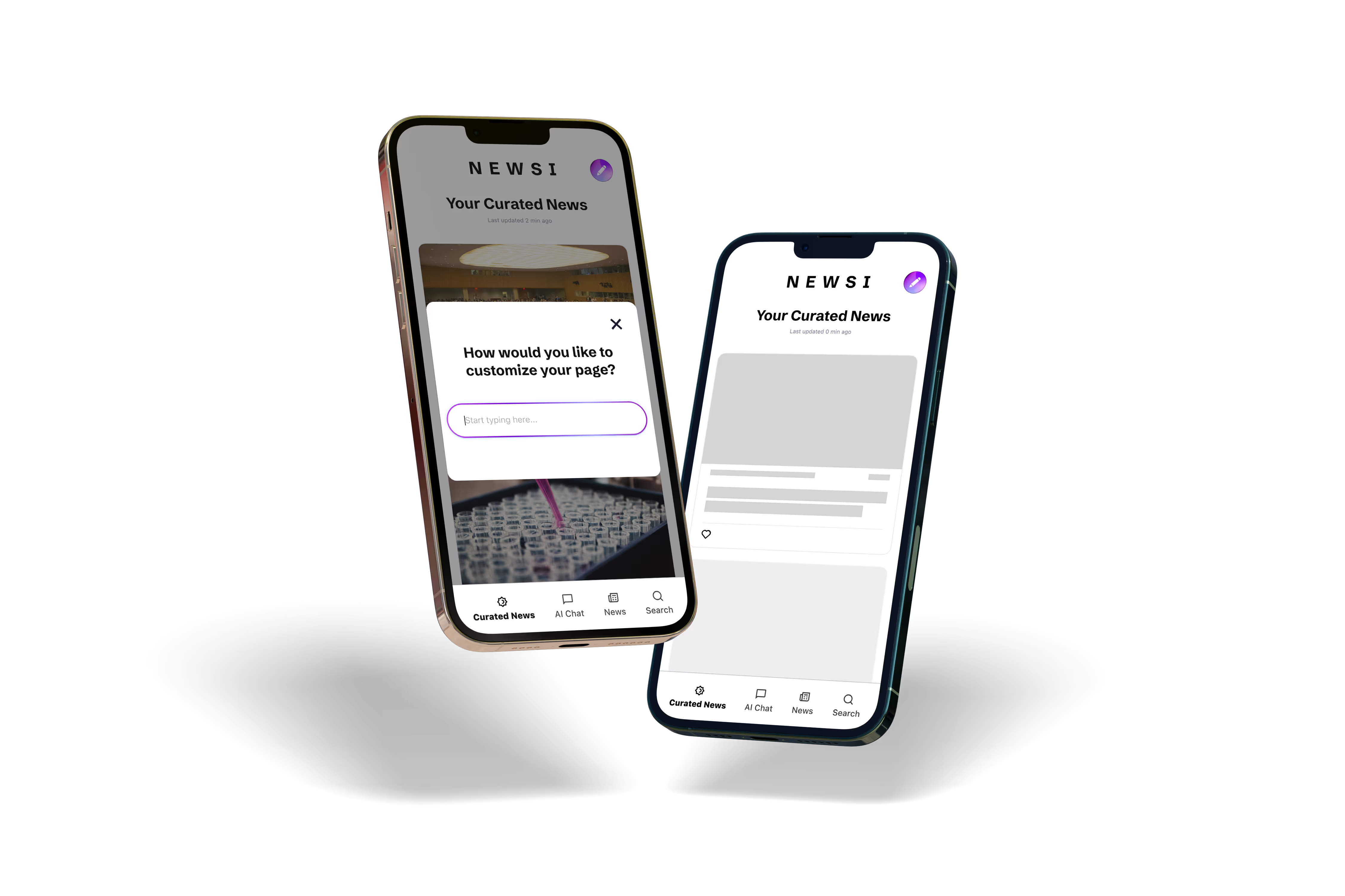
After finalizing the desktop version of the site, I proceeded to design for tablet and mobile devices. I maintained consistent feature placement across all device sizes to ensure a seamless responsive design.
After finalizing the desktop version of the site, I proceeded to design for tablet and mobile devices. I maintained consistent feature placement across all device sizes to ensure a seamless responsive design.