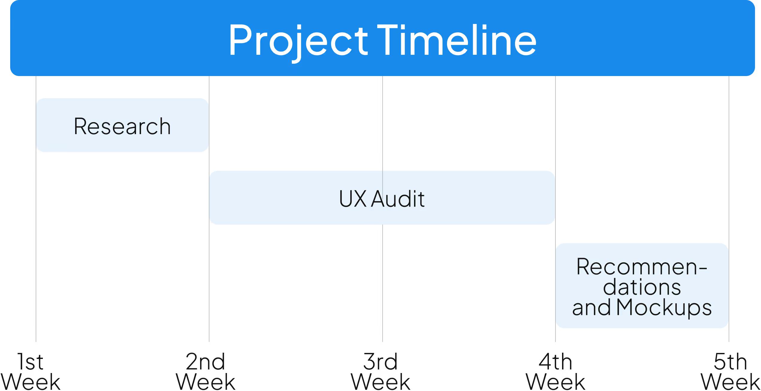
The following case study is based on a real-life project, but the names of the individuals and organizations involved have been changed to protect their confidentiality as per our non-disclosure agreement.


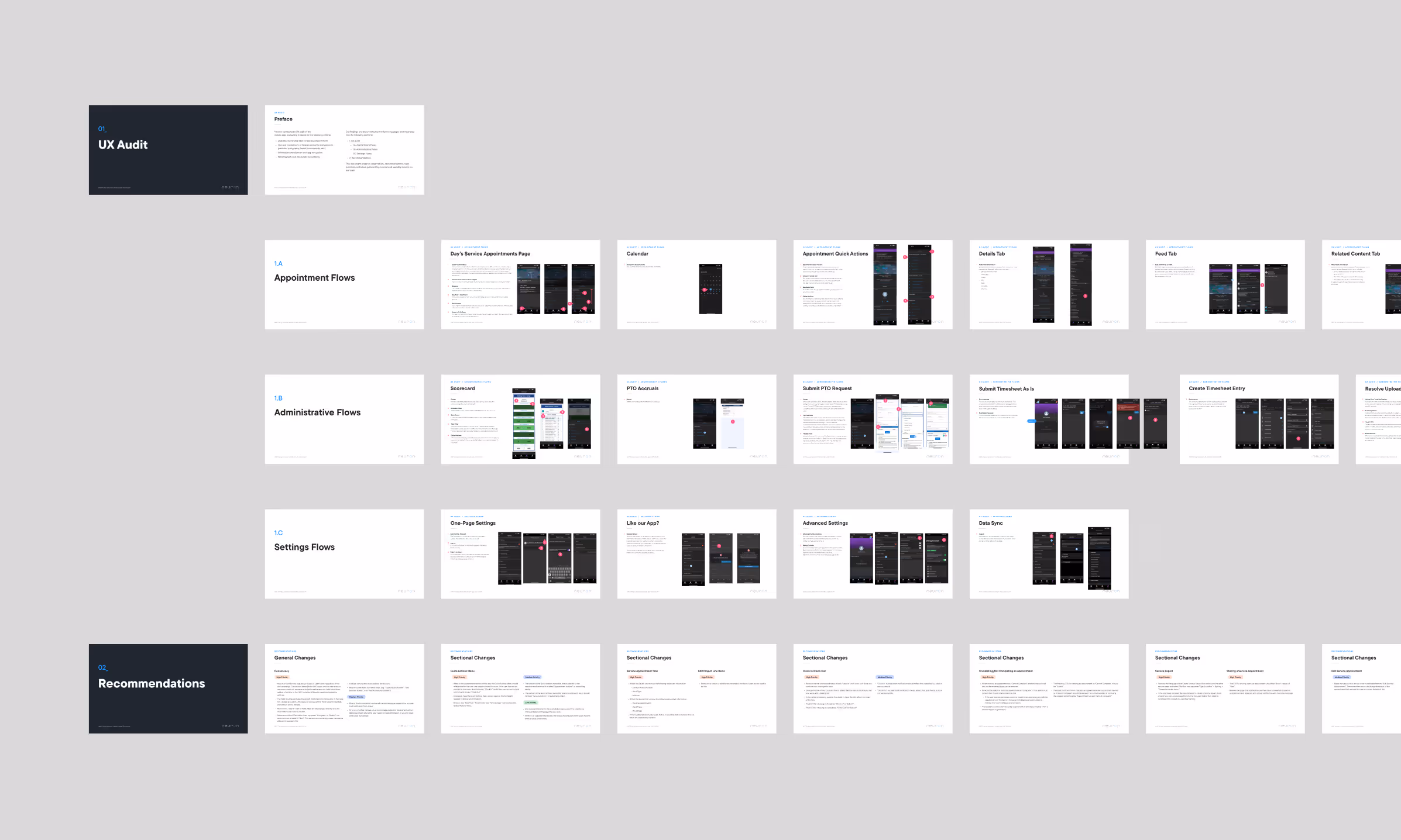
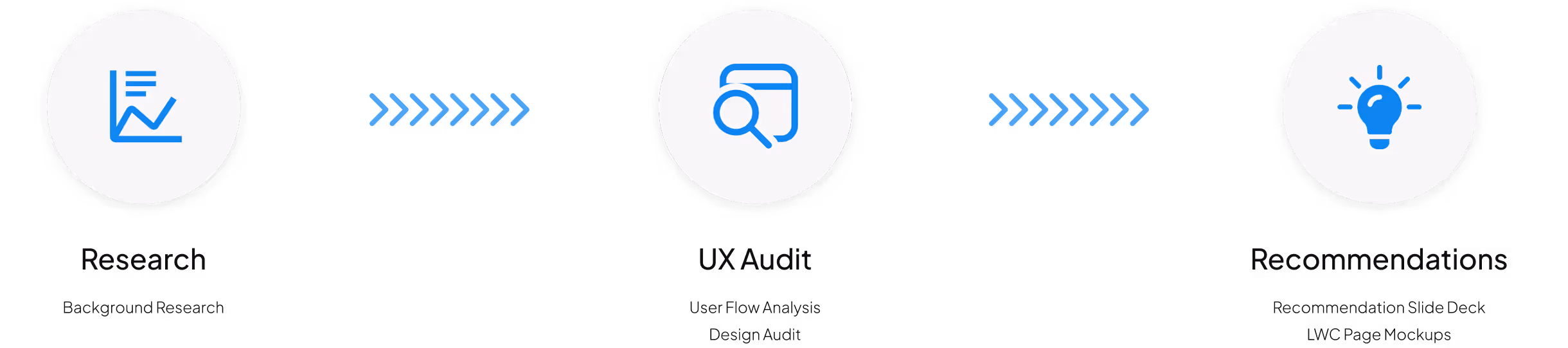
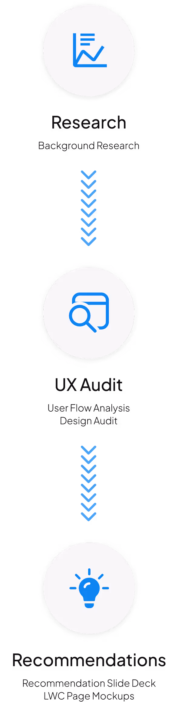
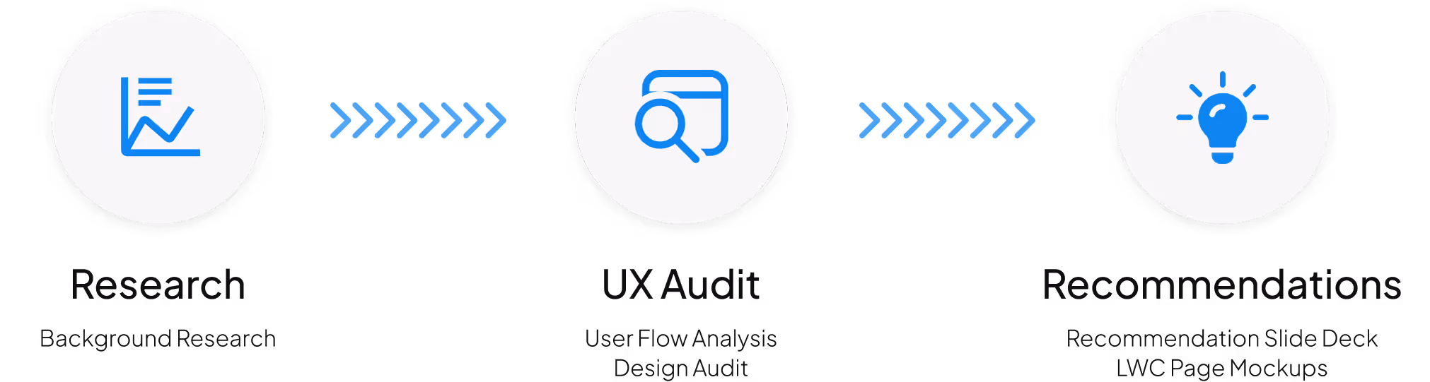
The audit process began with a comprehensive deep dive into Salesforce’s Lightning Web Components and Lightning Design System. From there, a user-centered audit took place of the app, taking into account restrictions from the Salesforce Field Service App environment, as well as the LWC system.
The research revealed that Lightning Web Components (LWC) represented Salesforce's modern framework for building custom components, available in both open-source and platform-specific versions. When implementing LWC, developers needed to prioritize its use over the older Aura components due to its simpler structure and better performance metrics, with some implementations showing up to 60% improvement in page load times. The framework required specific naming conventions and folder structures, while its minimal built-in CSS necessitated integration with the Salesforce Lightning Design System (SLDS) for robust user interfaces. Performance optimization was achieved through strategic data handling, including the use of Lightning Data Services, client-side caching, and lazy loading techniques, while security was managed through the Lightning Locker architecture and careful handling of third-party extensions. The framework demonstrated strong mobile and offline capabilities, featuring responsive design support and custom dashboard creation options, though developers needed to be aware of certain platform-specific limitations, particularly regarding global quick actions and iOS component loading behaviors.
Lightning Web Components significantly outperformed older Aura components, demonstrating up to 60% faster page load times due to its streamlined architecture and closer alignment with modern web standards.
The framework's minimal built-in CSS, while initially limiting, created an opportunity for robust customization through integration with the Salesforce Lightning Design System (SLDS), enabling consistent and scalable user interfaces.
Strategic data handling emerged as critical to performance, with Lightning Data Services, client-side caching, and lazy loading techniques serving as primary tools for optimizing component behavior and reducing server calls.
Despite strong mobile and offline capabilities, the framework exhibited important platform-specific constraints, particularly in iOS environments and with global quick actions, highlighting the need for careful consideration during implementation planning.
Sunshine Energy developed custom pages using Lightning Web Components (LWC) to establish new user flows, which required redesign and layout improvements for clarity, usability, and consistency with the Salesforce Lightning Design System (SLDS). Since the Field Service App adopts the device's font style and Sunshine Energy exclusively uses iOS devices for their field teams, all text on these pages needed updating to SF Pro.
Several user flows became an endless loop of “Next Step” options.
Many flows needed UX writing updates for clarity. An example of this was, often, the final CTA for a flow would simply say “Next”, which makes the user believe there are more steps. Instead, it was suggested that Sunshine Energy replace those with the word “Complete” or, if appropriate, a task specific finalization CTA such as “Clock In”.
Throughout the application, many default options were available for users to take that had a stakeholder specific alternative built in by the Sunshine team.
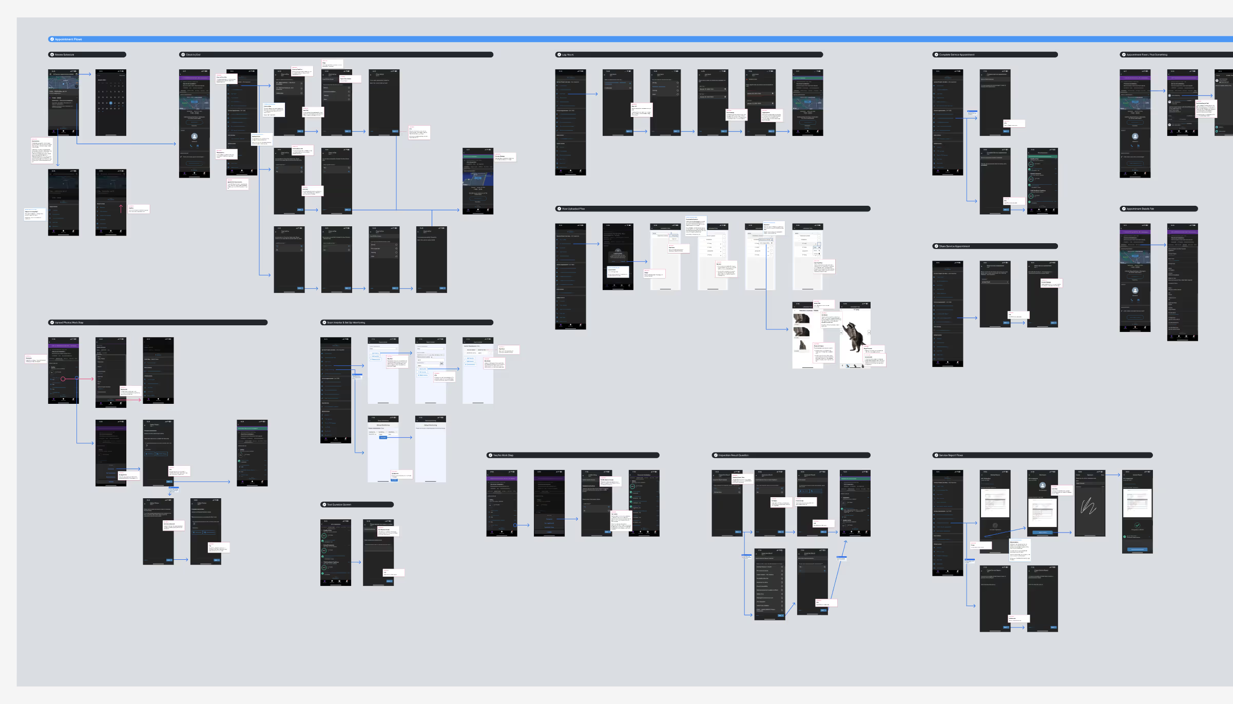
Changing toast message notifications to be action specific. (i.e. Clocking in creates a “Clock In Successful” toast message.)
Minimizing the number of pages involved in a user flow. Often within tasks, questions that could be combined in a single step were separated despite the next question not being conditionally dependent on the previous answer.
Removing redundant information available in several areas of the app.
Building new custom page flows with LWC and updated SLDS.
The UX audit of Sunshine Energy's mobile app revealed significant opportunities for improvement through the implementation of Salesforce Lightning Design System and Lightning Web Components. By addressing inconsistent UI elements, streamlining user flows, and updating UX writing for clarity, the audit provided a clear roadmap for enhancing the overall user experience. The recommended high-priority changes—including action-specific notifications, simplified page flows, and elimination of redundant information—demonstrate how thoughtful application of modern design principles can transform a frustrating user experience into an intuitive and efficient one. This case study illustrates the critical importance of consistent design systems in creating cohesive, user-centered mobile applications, particularly within the constraints of enterprise platforms like Salesforce.